When people think about accessibility in buildings, the first things that often spring to mind are ramps, lifts and accessible toilets, and while these features are essential, there is one aspect of a few that are frequently overlooked, and here we focus on visual contrast.
Visual contrast plays a major role in how people perceive depth and boundaries and helps ensure they can safely navigate and to, through and use a building. Like all aspects of inclusive design, well-designed visual contrast benefits everyone, and can make all the difference between a building that is technically compliant and one that is genuinely easy to use.
This article explores why visual contrast is so important, what designers and building owners should consider, how improvements help people, and the areas that are often overlooked.
What is visual contrast?
Visual contrast refers to a clear difference in lightness and darkness between adjacent surfaces, such as a door contrasting with a wall.
This contrast is achieved through differences in Light Reflectance Value (LRV), the universal value used to assess visual contrast. LRV indicates how much visible light a surface reflects on a scale from 0 (pure black) to 100 (brilliant white). The greater the difference in LRV between two surfaces, the greater the visual contrast, and although some people find very stark visual contrast changes a problem (for example using white / black) the vast majority of people will benefit from some visual contrasting being applied to key areas.
A common misconception is that visual contrast is simply about using different colours: however, two colours can appear very similar in tone, particularly to people with vision impairment or colour vision deficiency, resulting in little or no perceivable contrast.
Effective visual contrast relies not just on colour, but on differences in lighting levels, tone, and reflectance (gloss or sheen) to ensure key features can be clearly seen.
What are the legal requirements around visual contrast?
Getting visual contrast right isn’t just about good practice. Under the Equality Act 2010 it’s a legal requirement to make ‘reasonable adjustments’ to prevent disabled people being disadvantaged. That means visual contrast is imperative to ensure visually impaired users can move around safely and independently.
This is enforced by Approved Document M which explicitly references the need for visual contrast to help people identify key features within a building, such as:
- Doors contrasting with surrounding walls
- Stair nosings clearly contrasting with the rest of the step
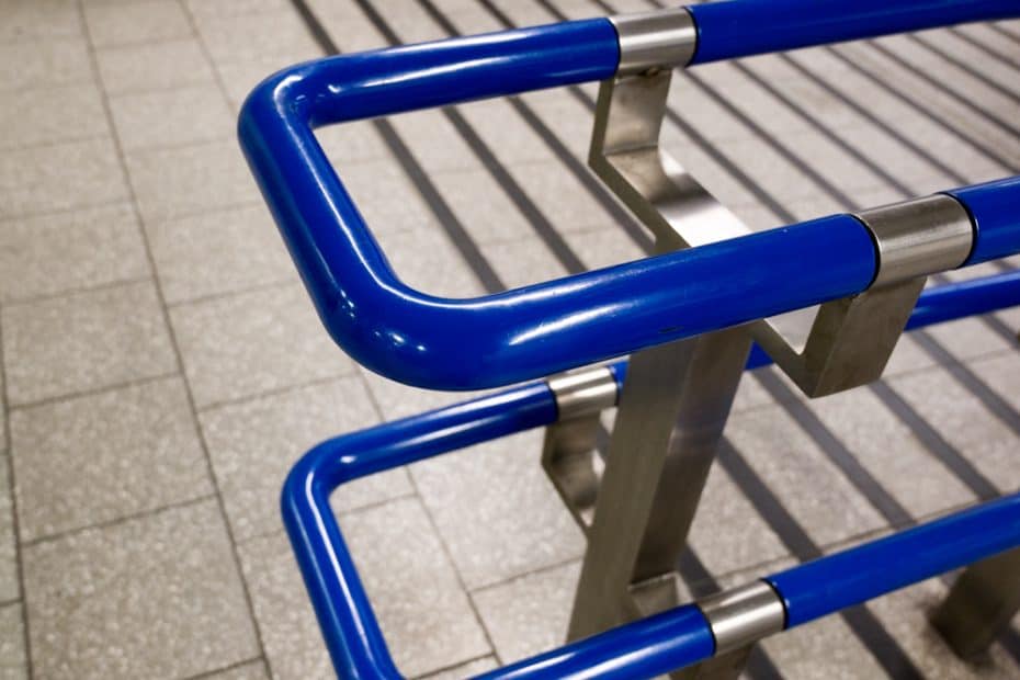
- Handrails being distinguishable from backgrounds
- Signage text contrasting visually with the fascia board, which in turn should contrast with its surroundings.
Alongside BS 8300 (Parts 1 and 2), Approved Document M specifies that the recommended difference in LRV should be a minimum of 30 % between surfaces.
However, visual contrast can be affected by:
- Lighting levels
- Surface finish (matte vs gloss)
- Shadows and glare
So, if an area is brighter, specifically 200 lux or more, a 20-point LRV difference is acceptable for larger elements that are required to be seen.
This highlights the importance of not basing decisions on design drawings alone but experiencing the environment first-hand to gain a true understanding of the LRV and its appearance. It also highlights why you should involve accessibility consultants. As experts in inclusive / accessible design and visual contrast, we will help ensure you get it right, are complying with Building Regulations as well as meeting your duties under the Equality Act 2010.
Why is visual contrast essential?
Visual contrast makes a building accessible by enabling everyone to safely and independently navigate, understand and use the spaces. In particular, visual contrast:
Supports people with vision impairments
People with low vision, colour blindness, or age-related sight loss may struggle with fine detail. Strong visual contrast allows them to identify key features such as doors, handles and steps allowing them to navigate around a building without constant assistance.
Reduces cognitive load
Clear contrast (but not too stark) helps people process information faster, which is beneficial for individuals with cognitive impairments, neurodivergent individuals, or anyone navigating a space who is under stress or fatigue.
Improves safety
Poor contrast increases the risk of trips, falls, and collisions. Highlighting hazards such as changes in level, steps, glazed surfaces, and door edges makes buildings safer for everyone.
Key considerations when thinking about visual contrast
Visual contrast is applicable to all areas of a building, both inside and outside. Some of the key considerations we always factor into our work include the following.
1. Entrances and wayfinding
- Ensure entrances are clearly distinguishable from their surroundings
- Use visually contrasting colours for any signage and information boards
- Make sure key routes are visually clear from the moment someone enters the building.
2. Doors and door furniture
- Doors should contrast with frames and/or adjacent walls. When the door is shut, it should be obvious it’s a door. If it can be left open, its edge must visually contrast as well.
- Handles, push plates, and locks should contrast with the door surface.
- Glazed doors should have visible manifestations, such as dots, lines or patterns at appropriate heights to prevent collisions. These also must visually contrast with any background they may be seen in front of (light and dark parts to the manifestations may be needed).
3. Stairs and changes in level
- Stair nosings should have a clear visual contrast when seen against the step surfaces (tread and riser).
- Ramps / landings should be easy to identify for safety as well as ease of navigation
- Handrails should contrast with their backgrounds.
4. Floors and walls
- Floor and wall finishings / skirtings should clearly contrast
- Changes in flooring should indicate if there is a change in level
- Glossy surfaces can cause unwanted reflections / wet appearances or even cause glare and can reduce the effect of visual contrast.
5. Lighting
- Poor lighting can sabotage even well-chosen visually contrasting colours; installed lighting should have good colour rendering
- Avoid strong shadows or surfaces being overly bright, as this can produce glare
- Ensure consistent (uniformity) of lighting levels along routes
- Consider how both natural and artificial lighting can change how colours appear.
Features people often forget to consider
Despite best intentions, there are several factors which are commonly overlooked:
Controls and Interfaces
- Light switches, sockets, door controls, thermostats, intercoms, and lift buttons often blend into walls and must stand out visually
Furniture and Fixtures
- Seating that matches the floor can be hard to identify and become a hazard
- Sanitary fittings that blend into walls / floors can cause confusion
Temporary and Seasonal Changes
- Pop-up signage, queues, or temporary barriers may not follow visual contrast principles and this is an easy fix that must be considered
- Seasonal decorations can reduce clarity of routes and exits
- Different weather conditions can have an impact on lighting and therefore on visual contrast levels.
External Areas
- Signage,, path edges and building entrances (especially in glazed facades / walls) are often overlooked
- Kerbs, bollards, and steps also need clear visual contrast, especially as they are often used in low light or wet conditions.
Maintenance Over Time
- Wear, repainting, or replacement materials may reduce visual contrast unless considered at the appropriate time.
- Remember that what was once compliant can quietly become inaccessible.
Visual contrast should not be underestimated
Visual contrast is a fundamental part of inclusive and accessible design, not an optional extra. It shapes how people understand and experience a building, affecting safety, independence, and dignity.
By thinking beyond minimum compliance and considering visual contrast at every stage, we can create buildings that work better for everyone. Remember, inclusive design isn’t just about meeting standards; it’s about making spaces that are clear, welcoming, and are genuinely usable by all.
If you’re concerned poor visual contrast is creating barriers in your premises, or are worried you’re not meeting your Equality Act duties, please get in touch. We will be delighted to advise you.